
WPF Prism extra: 1 ~ TreeViewItem を MVVM パターンで展開する ~

前回は List 系コントロールの各項目ごとに VM を作成する方法を紹介したので、本来は View で発生したイベントを Command へバインドする方法を紹介するのが本筋ですが、Prism 入門の付録的なエントリとして TreeViewItem を全展開する方法を紹介します。
尚、この記事は Visual Studio 2017 Community Edition で .NET Framework 4.7.2 以上 と C# + Prism 7.1 + ReactiveProperty を使用して 、WPF アプリケーションを MVVM パターンで作成するのが目的で、C# での基本的なコーディング知識を持っている人が対象です。
IsExpanded をバインドして TreeView を全展開
現時点でサンプルアプリを実行すると fig. 1 のように TreeViewItem が全て閉じた状態で起動しますが、全展開した状態で起動する方法を紹介します。
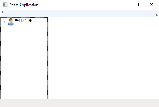
fig.1 TreeViewItem が全て閉じた状態で起動する MainWindow
Windows Form であれば TreeView の ExpandAll メソッドを呼ぶだけで目的は達成できますが、MVVM パターンで作成する場合はコントロールのメソッドを直接呼ばないので TreeViewItem.IsExpanded プロパティをバインドすることで実現します。
TreeViewItem のプロパティをバインド
TreeView 自体のプロパティをバインドする方法は今まで紹介してきた通りですが、子項目のプロパティをバインドするためには src. 1 のように Style として定義する必要があります。
1 2 3 4 5 6 7 8 9 10 11 12 13 14 15 16 17 18 19 20 21 22 23 24 25 26 27 28 29 30 31 | <UserControl x:Class="WpfTestApp.Views.NavigationTree" xmlns="http://schemas.microsoft.com/winfx/2006/xaml/presentation" xmlns:x="http://schemas.microsoft.com/winfx/2006/xaml" xmlns:prism="http://prismlibrary.com/" xmlns:mc="http://schemas.openxmlformats.org/markup-compatibility/2006" xmlns:i="http://schemas.microsoft.com/expression/2010/interactivity" xmlns:d="http://schemas.microsoft.com/expression/blend/2008" mc:Ignorable="d" d:DesignHeight="300" d:DesignWidth="300" prism:ViewModelLocator.AutoWireViewModel="True"> <Grid> <TreeView ItemsSource="{Binding TreeNodes}"> <TreeView.Resources> <Style TargetType="TreeViewItem"> <Setter Property="IsExpanded" Value="{Binding IsExpanded.Value, Mode=TwoWay}" /> </Style> </TreeView.Resources> <TreeView.ItemTemplate> <HierarchicalDataTemplate DataType="{x:Type nt:TreeViewItemViewModel}" ItemsSource="{Binding Children}"> <StackPanel Orientation="Horizontal"> <Image Source="{Binding ItemImage.Value}" Width="25" Height="25" /> <TextBlock Text="{Binding ItemText.Value}" /> </StackPanel> </HierarchicalDataTemplate> </TreeView.ItemTemplate> </TreeView> </Grid> </UserControl> |
子項目のプロパティをバインドするために Style を定義すると言うのは何となく違和感がありますが、『クラス型のコントロールプロパティとバインドするには Style を定義する』と解釈すれば良いと思います。
又、Style の定義を Resources タグで囲むのは以下のように XAML での決まりのようです。
スタイルとリソース - スタイルの基本 - スタイルとテンプレート【Microsoft Docs】

XAML の Resources セクションについて検索すると「外観を共通化するために Resources へブラシを定義する」等の例が多く見つかると思いますが、上に書いた通りクラス型のコントロールプロパティをバインドする場合にも使用します。
VM 側にも src. 2 のハイライト箇所を追加します。
1 2 3 4 5 6 7 8 9 10 11 12 13 14 15 16 17 18 19 20 21 22 23 24 25 26 27 28 29 30 31 32 33 34 35 36 37 38 39 40 41 42 43 44 45 46 47 48 49 50 51 52 53 54 55 56 57 58 59 60 61 62 63 64 65 66 67 68 69 70 71 72 73 74 75 76 77 78 79 80 81 82 83 84 85 86 87 | using System.Reactive.Linq; using Prism.Mvvm; using Reactive.Bindings; using Reactive.Bindings.Extensions; namespace WpfTestApp.ViewModels { public class TreeViewItemViewModel : BindableBase, IDisposable { /// <summary>TreeViewItemのテキストを取得します。</summary> public ReadOnlyReactivePropertySlim<string> ItemText { get; } /// <summary>TreeViewItem のImageを取得します</summary> public ReactiveProperty<System.Windows.Media.ImageSource> ItemImage { get; } /// <summary>子ノードを取得します。</summary> public ReactiveCollection<TreeViewItemViewModel> Children { get; } /// <summary>TreeViewItem の元データを取得します。</summary> public object SourceData { get; } = null; /// <summary>TreeViewItemが展開されているかを取得・設定します。</summary> public ReactivePropertySlim<bool> IsExpanded { get; set; } /// <summary>ReactivePropertyのDispose用リスト</summary> private System.Reactive.Disposables.CompositeDisposable disposables = new System.Reactive.Disposables.CompositeDisposable(); /// <summary>コンストラクタ</summary> /// <param name="treeItem">TreeViewItem の元データを表すobject。</param> public TreeViewItemViewModel(object treeItem) { this.Children = new ReactiveCollection<TreeViewItemViewModel>() .AddTo(this.disposables); this.SourceData = treeItem; var imageFileName = string.Empty; switch (this.SourceData) { case PersonalInformation p: this.ItemText = p.ObserveProperty(x => x.Name) .ToReadOnlyReactivePropertySlim() .AddTo(this.disposables); imageFileName = "user.png"; break; case PhysicalInformation ph: this.ItemText = ph.ObserveProperty(x => x.MeasurementDate) .Select(d => d.HasValue ? d.Value.ToString("yyy年MM月dd日") : "新しい測定") .ToReadOnlyReactivePropertySlim() .AddTo(this.disposables); imageFileName = "heart.png"; break; case TestPointInformation t: this.ItemText = t.ObserveProperty(x => x.TestDate) .ToReadOnlyReactivePropertySlim() .AddTo(this.disposables); imageFileName = "test.png"; break; case string s: this.ItemText = this.ObserveProperty(x => x.SourceData) .Select(v => v as string) .ToReadOnlyReactivePropertySlim() .AddTo(this.disposables); if (s == "身体測定") { imageFileName = "physical_folder.png"; } else if (s == "試験結果") { imageFileName = "test_folder.png"; } break; } var img = new System.Windows.Media.Imaging.BitmapImage( new Uri("pack://application:,,,/NavigationTree;component/Resources/" + imageFileName, UriKind.Absolute)); this.ItemImage = new ReactiveProperty<System.Windows.Media.ImageSource>(img) .AddTo(this.disposables); this.IsExpanded = new ReactivePropertySlim<bool>(true) .AddTo(this.disposables); } /// <summary>オブジェクトを破棄します。</summary> void IDisposable.Dispose() { this.disposables.Dispose(); } } } |
ReactivePropertySlim で宣言したバインド先の IsExpanded は View 側の値を受け取る必要もあるため、読み書き可能なプロパティとして定義して、XAML 側にも src. 1 のように『Mode=”TwoWay”』を追加します。
そして、コンストラクタで IsExpanded の初期値を true に設定するだけで、fig. 2 のように TreeViewItem が全展開された状態で起動するようになります。(展開状態を個々に設定したい場合は、VM 側で IsExpanded に値を設定します)
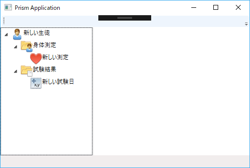
fig.2 TreeViewItem を全展開した MainWindow
このように extra シリーズは Prism 入門のオマケ的な情報を紹介するエントリになる予定です。
次回の本筋 episode は、最初に書いた通り View のイベントを Command へバインドする方法を紹介する予定です。
ここで紹介したソースコードも他の Prism 入門の episode と同じく GitHub リポジトリ に上げていますが、このエントリの内容は元々 episode: 6 の一部だったため episode: 6 のソリューション に含まれています。

次回記事「されどイベントは ViewModel と踊る【episode: 6 WPF Prism】」


